
Key Points
- Don't just look at current state to determine the progress of your migration or transformation.
- When graphing progress over time, consider breaking down the progress by dimensions such as the content contributor.
Content migrations and transformations can be a bit chaotic. One way to better understand what is happening during a migration and to increase the chances of success is strong tracking of progress.
One element is often overlooked: tracking over time. Instead, teams will often track the current state.
An example: 50% complete at 50% time
Perhaps there are weekly updates on the percentage of the migration that's complete. In the middle, let's say that the team announces that 50% of the pages have been migrated and that this is 50% of the migration time leading to launch. You may be tempted to say this is a good situation.
![]()
Fundamentally, we don't really know if this is good or not. Part of the issue with just looking at the current and target state is that we are only imagining the past and future. This is especially true if you are reporting this up a management chain, where the higher it goes the less context will be provided.
![]()
In addition to point-in-time updates, I recommend tracking the trajectory of the migration as well. For instance, here is an example where 50% is done at 50% of the time, but we're probably headed toward not meeting expectations:
![]()
One common situation is that teams start off with the easier-to-migrate content (this is not something I recommend). This can mean that initially there is rapid progress. The graph above could represent this kind of situation, where initially there was promising progress but then things started slowing down (for instance, the templates could not accommodate the more complex content).
Diving into slow-downs
As noted above, the primary reason to track progress over time is better visibility into what's really going on. And slowdowns are the primary thing we need to be alert to. When we see a slowdown we have several options, including:
Announce a slip to the schedule.
Reduce the quality of the migration (this isn't quite as bad as it might sound).
Refine processes to be more efficient.
Restack technical development to ease content development (for instance, improve the templates so they require less manual content work).
Train folks better.
To decide on the best approach, we need to dive a little deeper than just the overall page count complete over time. For instance, here is an example where the progress was tracked by content contributor:
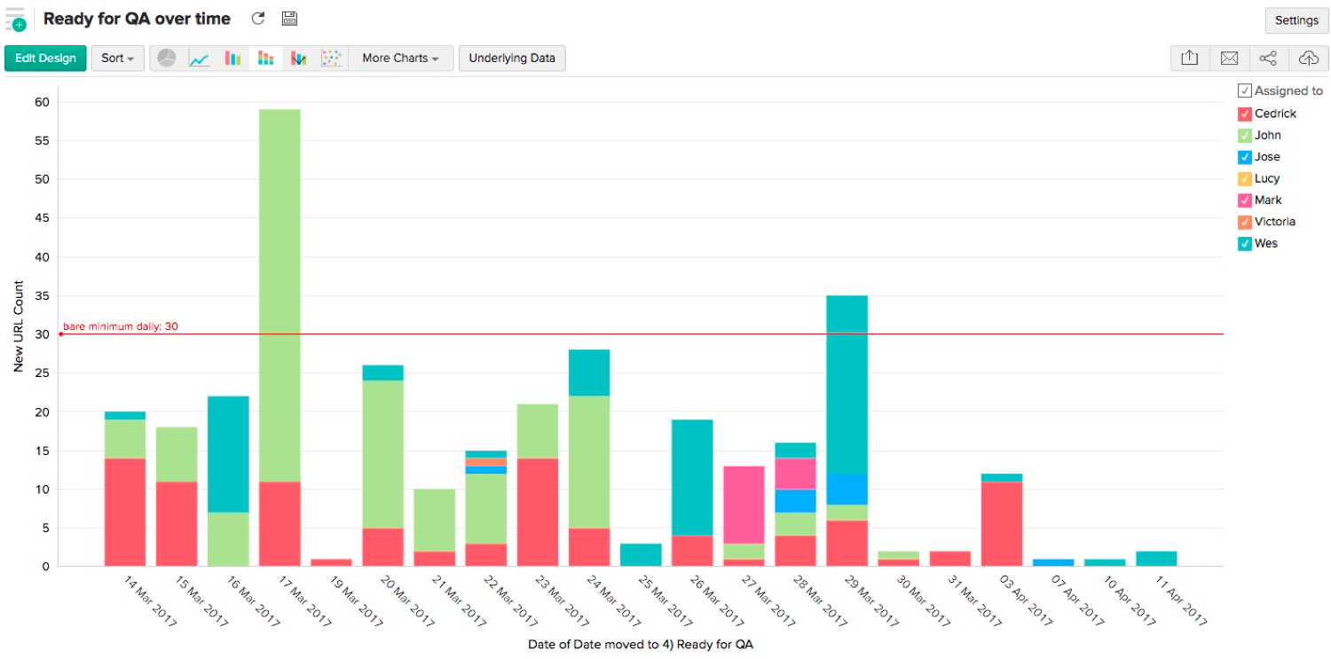
In this graph we are looking at the day-by-day progress rather than cumulative progress — this is so we can more easily see the people behind the changes. In this sort of graph, we can see if particular content contributors are struggling or perhaps are unavailable.
We may wish to color over-time graphs by other elements, such as template or content type, estimated effort, team, priority, sprint, or other attributes.