Key Points
- Confusing duplicate content is bad enough, but OBSCURED content is the worst kind of duplication.
- We can evaluate problem duplication along a scale of how bad the experience for site visitors is.
- Duplication can be a problem in many contexts, including search results and activity feeds.
Some problem duplication causes more issues than others.
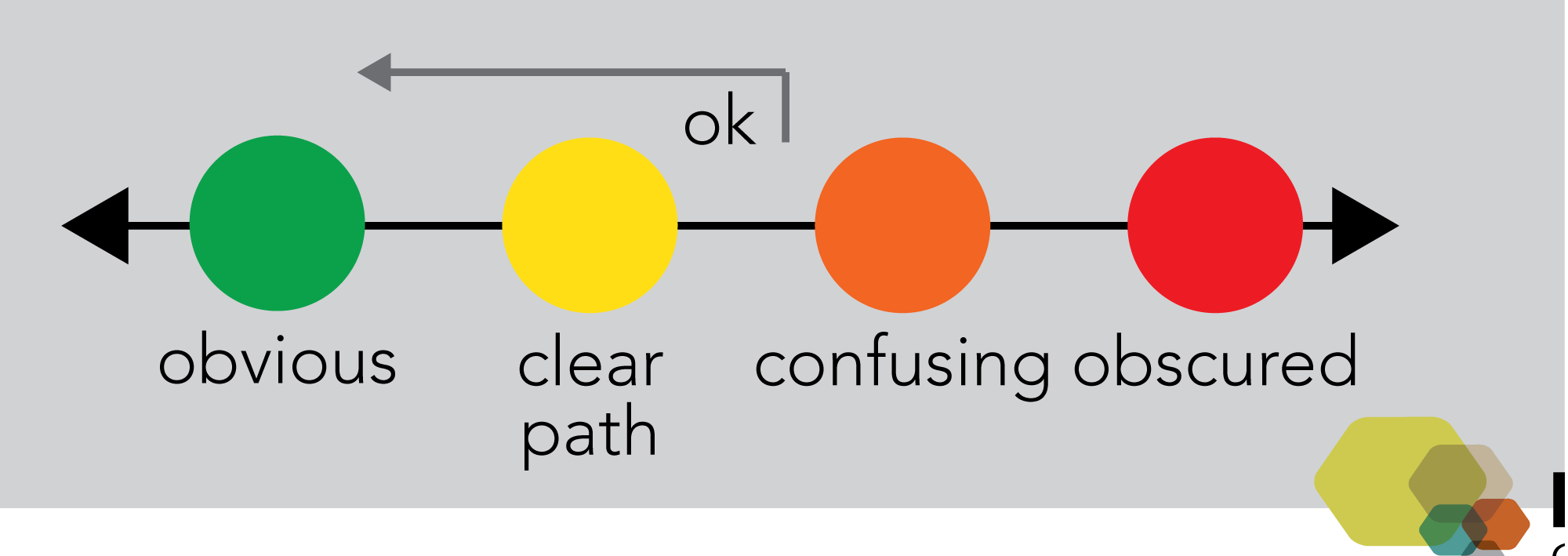
Just HOW BAD can the experience of duplication be?

Obvious. When I am attempting to accomplish a task, it’s obvious that I have the right information. This could either be because it’s the only copy or because the current and correct content is clearly presented (with other versions referenced /available but not prominent).
Clear path. Although there are duplicates, the user has a clear path to discover which version is the right one. For instance, if the search results show the most recent and definitive copy first, or if the two places the correct copy could be are clearly liked for the visitor to compare metadata for clarification (for example, the last-revised date). Note that for it to be a clear path it’s essential that the user does not have to actually open PDFs.
Confusing. In this case the intranet or website user has to do significant research to determine which copy is correct, for instant by having to open multiple PDFs to determine which is correct. In this case, users may abandon the intranet or website entirely and contact colleagues instead.
Obscured. In the confusing case, finding a list of content that includes the right copy is relatively straightforward, even if it might be difficult. In the obscured case, it is difficult or impossible to even find the right version. This can also occur when a part of the correct content is easy to find, but the complete version is difficult to find.
We want to aim for at least a clear path, avoiding confusing or obscured cases.