Key Points
- When attacking website issues on large and complex sites, try to summarize how widely the issues exist and where it happens in order to better plan.
- A pervasiveness table summarizes multiple issues across a digital presence.
- A multi-value heat table summarizes a single issue, but dives into the texture of the issue.
We need to understand and make decisions about our digital presences, both on an ongoing basis and during big change. But, especially for large digital presences, it can be tough to understand how pervasive issues are.
This is primarily a technique for large and complex digital presences, in particular those with multiple sites, a very old site, a site with a large number of pages, and/or a site with multiple content owners.
Why pervasiveness?
You need to understand where you are experiencing issues on digital presences, to understand how bad the issue is and where it is experienced. You may either wish to represent current or future state:
Issues that you are currently experiencing on your site (for instance, you may wish to know how many pages have a very large amount of text, since you know the walls of text are making it difficult for site visitors to understand the content) represent content that you can immediately take action on (and immediately see the benefits). But by seeing the current pervasiveness of the issue you will understand if this is a large or small undertaking.
Content that may or will become a problem during a transformation (for instance, you may be using HTML tables for layout on some of your current site, but you suspect these pages will be an issue when you move to a more responsive layout) need to be thoroughly understood to avoid surprises, since you not only need to understand the effort of a transformation but you may even change the transformation goals or execution based on a better understanding of what content will be causing you issues.
What kinds of values do we want to summarize?
These are some of the types of metrics we may wish to summarize:
The presence of something in a piece of content (yes or no, does the content have that or not?)
The count of something in a piece of content (this is usually summarizing a single content item)
The percentage of content that has that issue (this is summarizing multiple content items)
The actual values within the content (by either scraping information out of content or looking at the structured metadata)
Some examples of what we may want to capture:
| Presence | Count | Percentage | Actual values | |
|---|---|---|---|---|
| HTML Table | Has Table? (yes or no) | Table count (count of tables on a particular page) | Percentage of a particular content type that has HTML tables | Actual HTML table classes |
| iFrame | Has iFrame? (yes or no) | iFrame count (count of iFrames on a piece of content) | Percentage of a particular site section that has an iFrame | Actual iFrame width value |
| Country value | Has Country value? | Country count (count of different countries the content is tagged to) | Percentage of particular source system with a country value | Actual countries |
| jQuery | Has jQuery? | jQuery count (number of embeds on a particular page) | Percentage of pages per CMS that has jQuery | jQuery version(s) |
Types of pervasiveness visualizations
An effective manner of understanding pervasiveness is via visualizations, since it distills lots of details into a format that we can understand in summary.
In particular, we can categorize our pervasiveness visualizations against two dimensions:
How many fields / pieces of information are we visualizing?
How many values can each field have per content item?
| Single Field | Multiple Fields | |
|---|---|---|
| Single value per content item | Stacked bar chart | Pervasiveness table |
| Multiple values per content item | Multi-value heat table | Network view |
Stacked bar chart: single field, each content item with a single value
Previously I wrote about content hypotheses, which are statements about your content that you can test and then see the distribution of the issue. For instance, we may be undertaking a migration and be on the lookout for common issues that arise during migrations. So we may have the hypotheses "HTML tables are a pervasive across the site". We can test the hypothesis (in this case the hypothesis is true) and then see the distribution of the issue:
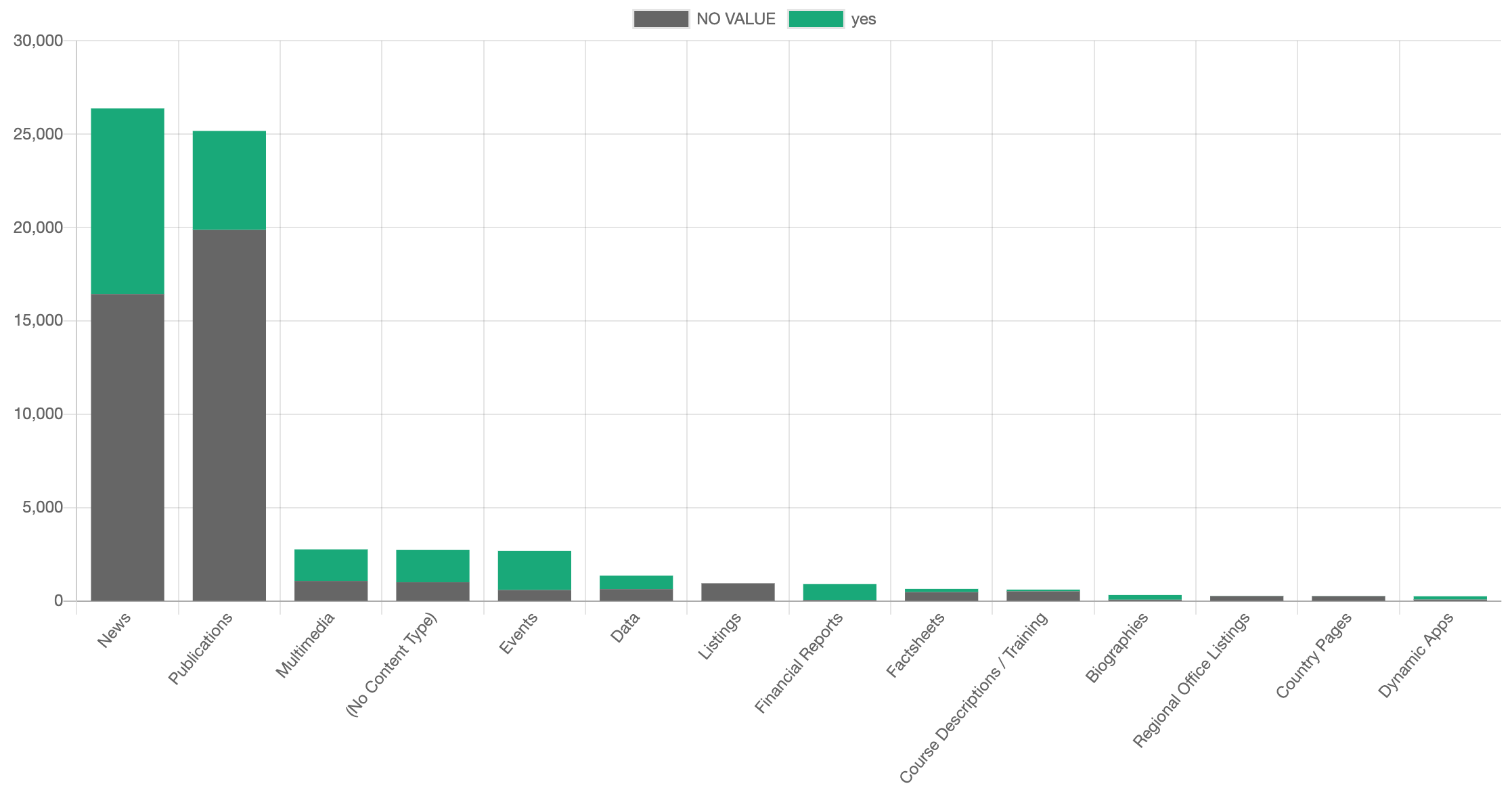
Having the distribution allows us to dig into this more. For instance, the next questions are "how big of an issue is it?" (perhaps having tables in some Content Types is actually not an issue from the migration perspective) and "what are we going to do about it?" (we may decide that we need to take action in some places and leave some alone), which are supported by rules which Content Chimera supports.
Pervasiveness table: multiple fields, each content item distilling a single value
Getting back to visualizations, we may wish to see the distribution of multiple fields. For instance, I developed this table to capture the overall pervasiveness of different metadata facets across a digital presence:
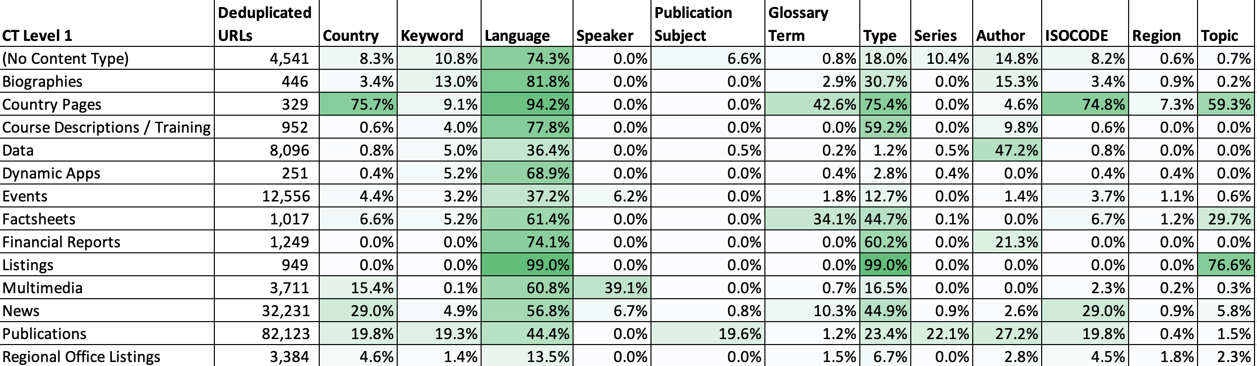
In this case we distill down multiple of the bar charts like above into a single table (we aggregate multi-values to percentages). And we can quickly discover which facets have higher percentages of values, and also where the facets appear. So for example we may discover that some content types actually should not have specific metadata values, so it's actually ok that there are no values.
But regardless the pervasiveness table does the following:
Summarizes (in the above case, percentages of the presence of values) ...
multiple fields (in the above case, it lists multiple metadata facets) ...
using a heatmapping method (in the above case, using heatmap scaling across the entire data set) ...
against a consistent set of rows (in the above case, each row is a Content Type).
Multi-value heat table: single field, but each page can have multiple values
There is a lot of information about pages that may have multiple values for each page. For instance, any page may be tagged to multiple topics. Or we may be interested in components on pages. For instance, digging more into that issue of HTML tables, we may wish to pull out the CSS class applied to each HTML table. In this case, rather than in a pervasiveness table where we are looking at multiple issues, in a multi-value heat table we are looking at a single issue but diving into the actual values. In the table below we are looking at content type (columns) by table class names (rows), so for example here we see that the class "colorBar" is used 136 times in news pages and 453 times in publications pages:

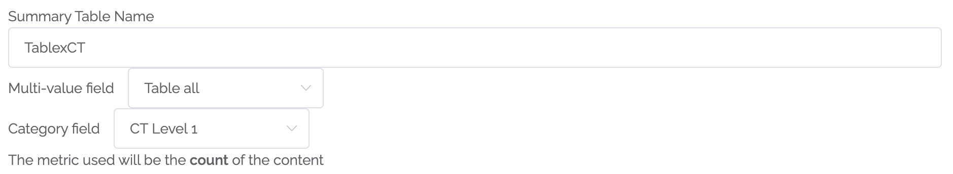
Behind the scenes the way to do this is in a graph database, although Content Chimera hides that implementation detail to generate these multi-value summaries. This is the definition for the above summary table:
Network view:multiple fields, but each page can have multiple values
As mentioned in the multi-value heat table above, the multi-value heat table was actually calculated with a graph database. That provides a useful summary view, and in general directly viewing and querying the graph is not necessary. That said, a graph database by its very nature can have multiple values represented directly.
It's a database that represents nodes and relationships between nodes. They are sometimes called semantic databases. The network view is simply a view of these nodes and relationships (in a complex database, this would just be a small portion of the database that is presented). The term "graph" in graph database refers to the mathematical definition rather than charts.
We can view the graph visually. Here is a slice of a database showing content type (green), pages (yellow), and pink (table classes):
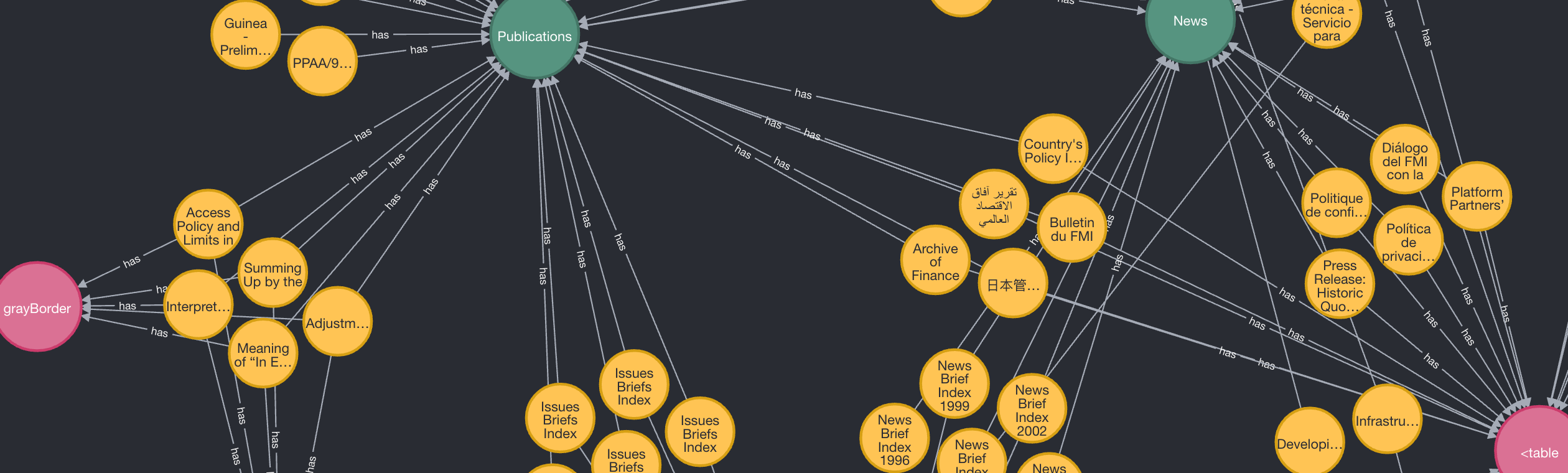
This is a very advanced approach and that quick screenshot is just to show that there is a method of displaying multiple fields with multiple values. In general this is more useful for actual analysis than summary presentations, so please concentrate on the other three options listed above.
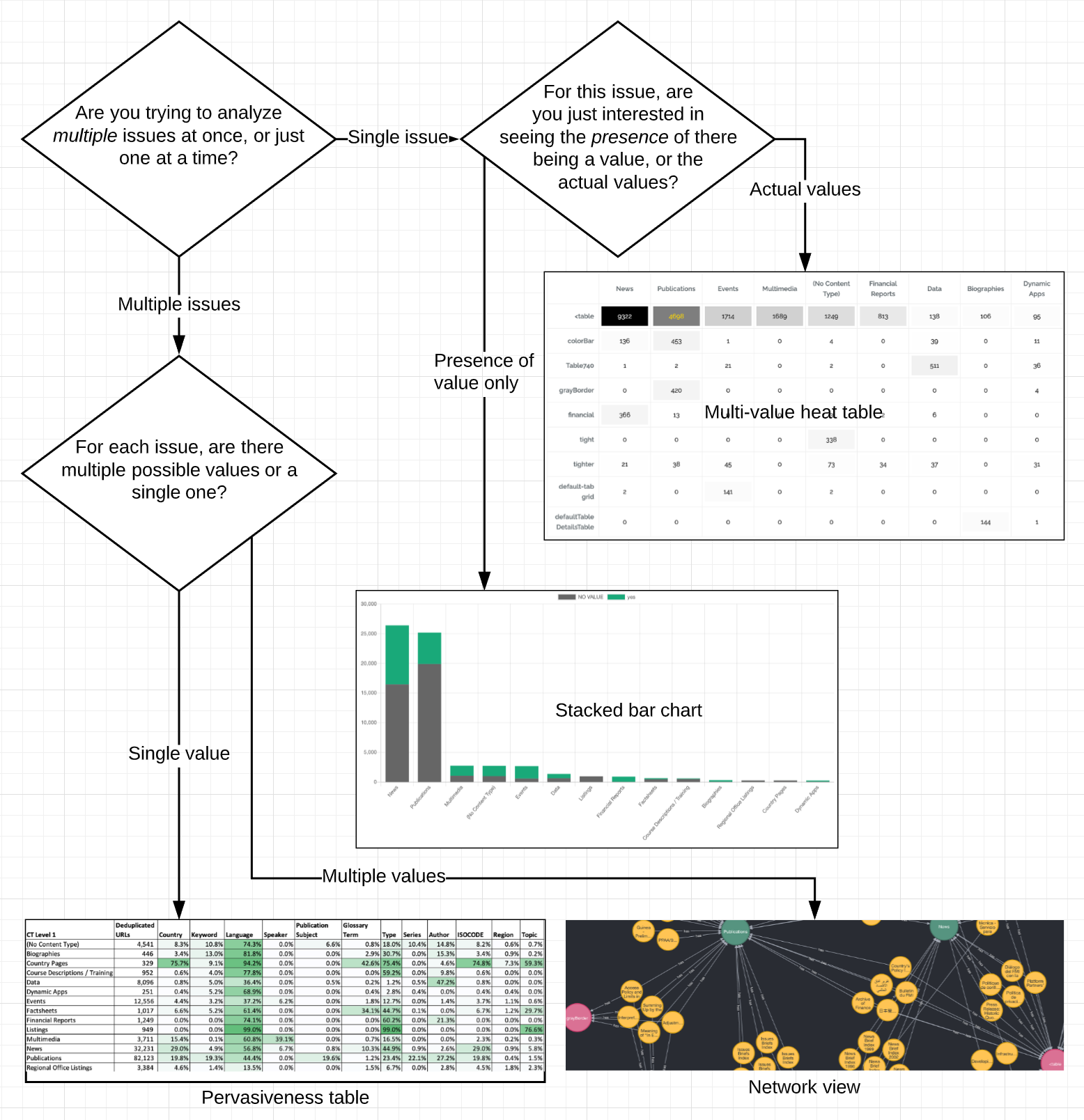
Pick the right way to visualize pervasiveness
Some of the above are far easier to implement than the others (in fact, they are listed from easiest to hardest), but attempt to visualize pervasiveness so you can better attack issues on your site. Here's a flowchart to help select the right visualization: