
Key Points
- Step back to plan before diving into a spreadsheet for your content analysis, including inventories and audits.
- Be clear on *why* you are doing content analysis and define the desired outputs.
- Consider the ideal extent of analysis and define the analysis participation model.
The vast majority of articles on content inventories and audits focus on the mechanics of using a spreadsheet for the task, potentially with a twist of some unique fields to capture. These articles tend to:
Presume that working in a spreadsheet is the best (or only) approach.
Presume that the entire audit or inventory will be analyzed line by line.
These assumptions are further entrenched when a spreadsheet template is offered.
Furthermore, not enough context is set before launching into the detailed analysis. Instead, follow these steps before diving into the details:
Remember non-spreadsheet, non-item-by-item approaches exist.
Be clear on why you are doing content analysis.
Define the desired outputs.
Consider the ideal extent of the analysis.
Define the participation model.
Note that these steps don't necessarily need to take much time, but regardless help to make the most of your work before diving into a spreadsheet.
First: Remember non-spreadsheet, non-item-by-item approaches exist
Yes, we all have spreadsheet apps on our computers and spidering tools to output a spreadsheet. But this does not mean that we should work in a spreadsheet and assume we'll be doing a line-by-line analysis. Instead, we can:
Use charts to see patterns about the content
Use rules to make decisions about content
And not stare at spreadsheets.
To accomplish this, you can either roll your own (relying on ETL and charting tools — watch the webinar Enterprise Content Inventories, covering the four types of tools needed) or use our tool Content Chimera, which is optimized to do that and more. For more on a non-spreadsheet approach, see SEER Content Analysis (Scalable, Engaging, Exploratory, and Repeatable).
Sometimes a traditional approach does work, but this depends on what you are trying to accomplish.
Second: Be clear on WHY you are doing content analysis
Another reason not to leap directly to spreadsheet work, even if a spreadsheet is the appropriate approach in your case, is you need to be clear on why you are doing the analysis. Of course there are the very high level reasons like "we need to improve the content" or "we have to figure out how to migrate the content". You need to dig a little deeper to make it more concrete. Here are some examples:
Foresee technical migration issues.
Analyze duplicate content.
Reduce the size of a digital presence.
Better scope a proposal for a site redesign.
Determine the pervasiveness of taxonomy facets by content type across multiple sites and domains to inform an enterprise-wide search improvement project.
Provide an overall understanding of a large, multi-site digital presence.
Understand manual migration effort (including determining if the majority can/should be automated).
Increase vested ownership in content.
Of course sometimes you don't really know the details of the questions until you dive in (another reason to consider an inventory an exploration, which is more difficult to accomplish in a spreadsheet). But you should still have one or more grounding reasons for taking on the analysis at all.
The "why" starts giving the analysis work some more shape. If you want to foresee technical migration issues, then you're almost certainly going to be scraping information out of pages (Content Chimera has several built in patterns that can be scraped). If you are analyzing duplicate content then manual analysis is pretty much useless (Content Chimera does near-duplicate text analysis). If you want to reduce the size of a digital presence, then you should use rules to do this rather than reviewing line-by-line (delete better), and you may wish to collect different information about each page to at least make initial cuts.
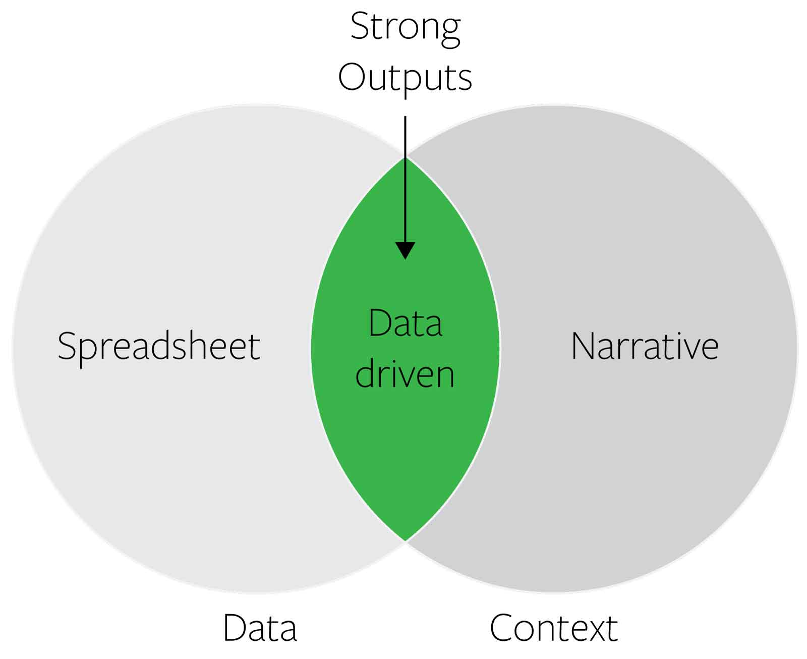
Third: Define the most effective OUTPUTS
Even if someone asks for it, a spreadsheet is rarely the most effective output. It may be a required output. It may be a good archival output. But it's probably not the most effective output.
Of course in almost all cases we need narrative surrounding our analysis. But too often the narrative analysis is very disjointed from the underlying data, or makes leaps of faith from the ad hoc analysis by looking at a sample of pages rather than true data-driven outputs.
A chart combines data and context. It is directly derived from the data, but by choosing what to chart you are also highlighting a particular pattern. Furthermore, a chart has the advantage that it takes little effort to consume, and a wide range of stakeholders can understand it.
Example useful outputs as a chart:
Pervasiveness tables, to show the pervasiveness of issues or the presence of needed components
Bar charts to show the distribution of decisions about content (what the current content is, how it will be moved/deleted, and who will do what)
A dashboard to show relative effectiveness of content (especially useful when aligned with site or content ownership)
Treemaps to show the hierarchy of large or complex sites or suites of sites
Also see the online quiz Use the right content chart and the webinar Seeing the Forest and Trees: Visualizing Large Digital Presences.
Once you have defined the outputs that would be most effective, you need to ensure that you have a process of acquiring the necessary information (remember: line-by-line, manual analysis is not always required, and not reasonable for large sites!) and then rendering it (for example to a chart).
Fourth: Consider the ideal extent of the analysis
Once you are in a spreadsheet, you are in a detail view. Not only are you in a detail view, you are in a sea of details. You keep scrolling and there's more and more content. You can bounce back out by filtering to see how many pages meet certain criteria, but fundamentally you are seeing trees and not the forest.
One significant problem is that once you are this sea of details, it can feel like you are looking at all the data. Furthermore, it's easy to just start looking at the details and feel like you're making progress.
That said, if you just start looking at the spreadsheet then you may be overlooking other major parts of the site (or other sites if you work on a large digital presence spanning multiple sites). For example, if you're looking to improve the overall usability of your digital presence, then just improving your main site may be insufficient (for instance, perhaps your document repository site is equally important).
Before you dive into your analysis or a spreadsheet, you need to define the extent of the analysis and make sure that your set of data contains all this. Consider:
Which sites / subdomains / domains should be included
Which site sections should be included
What languages should be included
Whether authenticated and unauthenticated needs to be included
What types of assets should be included
A related issue is your process to clean up the raw sheet, which really shouldn't be done manually, including by manual filtering (such as how you deduplicate page=1, page=2, etc URLs).
Also see:
Fifth: Define the iteration and participation model
One common, ineffective approach is to send a spreadsheet of all content to content owners for them to make some determination on their content (such as whether to delete it). This has a ton of problems:
Decisions are made less with organization-wide priorities than what specific groups feel about their content.
It's difficult to iterate — if you need to make a change to how you evaluate content, you have to resend the spreadsheet.
It's very one-off — it's not defining a process that's sustainable on an ongoing basis.
It's very difficult to keep everything merged effectively.
It's difficult to control fields so that everyone is filling it in effectively.
It wastes a lot of time.
It means that people are potentially spending the same time reviewing low-importance content as high-importance content.
The above are several reasons to use rules rather than line-by-line analysis.
But deciding on your approach needs to consider the following:
Who needs to participate in the content analysis? What does that participation need to look like? Would it be more efficient to send them tentative decisions, automated metrics, and the implications of this (such as how much content it looks like they will have to rewrite)?
What does the iteration model need to be? Are you really confident you know the questions and how to achieve it, so you can do it in one pass? Or, more likely, are you going to iterate?
One very effective approach is to simply use charts to drive participation, since it is easier to get broader engagement on charts. Also, if you use rules then you can demonstrate the implications of things that have been assumed (such as much less content would get deleted than expected if only content over one year old will be deleted).
Finally: Dive in!
Given all the above, you may still decide that a spreadsheet analysis is the way to go. Regardless, going through the above steps before diving into your detailed analysis will set the stage for a stronger analysis.